Card
Usage
Presentation
This is the display format for the constructor, designed to showcase what are its capabilities.
Example Basic
NASA Space Program
Per aspera ad astra
NASA explores the unknown in air and space, innovates for the benefit of humanity, and inspires the world through discovery. At its 20 centers and facilities across the country – and the only National Laboratory in space – NASA studies Earth, including its climate, our Sun, and our solar system and beyond. We conduct research, testing, and development to advance aeronautics, including electric propulsion and supersonic flight. We develop and fund space technologies that will enable future exploration and benefit life on Earth.
This is how it is constructed
::ShCard
---
text: |
    NASA explores the unknown in air and space, innovates for the benefit of humanity, and inspires the world through discovery. At its 20 centers and facilities across the country – and the only National Laboratory in space – [NASA](https://www.nasa.gov/) studies <a href="https://earth.google.com/web/" target="_blank">Earth</a>, including its climate, our Sun, and our solar system and beyond. We conduct research, testing, and development to advance aeronautics, including electric propulsion and supersonic flight. We develop and fund space technologies that will enable future exploration and benefit life on Earth.
title: |
    NASA Space Program
subtitle: |
    Per aspera ad astra
leftLabel: |
    Hello left [label](https://www.nasa.gov)
centerLabel: |
    Hello <a href="https://earth.google.com/" target="_blank">center</a> label
rightLabel: |
    Hello <a href="https://earth.google.com/" target="_blank">right</a> label
imageBackground: https://static.vecteezy.com/system/resources/previews/026/459/005/non_2x/abstract-background-images-wallpaper-ai-generated-free-photo.jpg
urlImage: https://www.nasa.gov/wp-content/themes/nasa/assets/images/nasa-logo.svg
urlUpperBase: https://www.nasa.gov
---
::
Props
These are the properties and attributes associated to the constructor:
Properties and Attributes Description
The constructor represents a card divided in two halfs, with upper half containing image, and lower half containing text with additional options for inserting labels. Text & labels both fully support Markdown syntax. Below is a detailed description of the properties and attributes used in the constructor.
| Property | Attribute | Default | Description |
|---|---|---|---|
ui |
n/a | n/a | The ui property in the component is a configuration object that allows customization of various styling aspects of the component. Each attribute within the ui property targets a specific part of the component display, providing detailed control over its appearance and layout. Below is a detailed description of each attribute within the ui property: |
wrapper |
config.wrapper |
Defines the overall styling for the container that holds all the elements of the component. | |
coverImage |
config.coverImage |
Defines the styling for the cover image that spans across the whole constructor | |
coverIcon |
config.coverIcon |
Defines the styling for the icon used for covering the constructor | |
coverText |
config.coverText |
Defines the styling for the cover text (including the color of the background) that spans across the whole constructor | |
upperBase |
config.upperBase |
Defines the styling for the upper section of the component, typically where the image is displayed. | |
upperBaseText |
config.upperBaseText |
Defines the styling for the text in the upper section of the component, instead of where the image is displayed. | |
image |
config.image |
Styles applied to the image element, including properties like size and border radius. | |
lowerBase |
config.lowerBase |
Defines the styling for the lower section of the component, typically where the text content is displayed. | |
title |
config.title |
Styles applied to the title text, such as font size and color. | |
subtitle |
config.subtitle |
Styles applied to the subtitle text, such as font size and color. | |
text |
config.text |
Styles applied to the text content, such as font size and color. | |
leftLabel |
config.leftLabel |
Defines the overall styling for the leftLabel that holds the text. | |
centerLabel |
config.centerLabel |
Defines the overall styling for the centerLabel that holds the text. | |
rightLabel |
config.rightLabel |
Defines the overall styling for the rightLabel that holds the text. | |
coverImage |
n/a | n/a | Link to external or internal image that will be presented as a cover across the whole constructor |
coverIcon |
n/a | n/a | Any valid icon from Iconify |
coverText |
n/a | n/a | Inscription that will be presented as a cover across the whole constructor (full Markdown support) |
opacity |
n/a | false |
Setting this to true will trigger fadeaway effect on coverImage or coverText. Default state triggers the transition effect |
upperBaseText |
n/a | n/a | Allows you to have text in upper section of this constructor, instead of an image |
urlUpperBase |
n/a | n/a | The URL that wraps the upper section of the component, typically for navigation purposes. |
urlImage |
n/a | n/a | The source URL of the image to be displayed. |
altImage |
n/a | n/a | Alternative text for the image, used for accessibility and in case the image fails to load. |
title |
n/a | n/a | The title text to be displayed. |
subtitle |
n/a | n/a | The subtitle text to be displayed, if any. |
text |
n/a | n/a | The main text content to be displayed. |
leftLabel |
n/a | n/a | The text to be displayed in the left label. |
centerLabel |
n/a | n/a | The text to be displayed in the center label. |
rightLabel |
n/a | n/a | The text to be displayed in the right label. |
imageBackground |
n/a | n/a | The background image for the component's image section. |
description |
n/a | n/a | Intented to be used as a help to content writter. Doesn`t render on website. |
Example Usage
Advanced Settings
An example with customized ui attributes for enhanced display:
Special cover effect can be applied to any , allowing the main content to be 'hidden' from the first sight, while revealing itself only on hover over. Here is the list of possible combinations of cover options w/ effects:
| Type | Transition | Opacity |
|---|---|---|
| Image | 🎞️ Image w/ Transition | 🌫️ Image w/ Opacity |
| Icon | 🎭 Icon w/ Transition | 🔳 Icon w/ Opacity |
| Text | ✍️ Text w/ Transition | 📄 Text w/ Opacity |
NASA Space Program
Per aspera ad astra
NASA explores the unknown in air and space, innovates for the benefit of humanity, and inspires the world through discovery. At its 20 centers and facilities across the country – and the only National Laboratory in space – NASA studies Earth, including its climate, our Sun, and our solar system and beyond. We conduct research, testing, and development to advance aeronautics, including electric propulsion and supersonic flight. We develop and fund space technologies that will enable future exploration and benefit life on Earth.
Welcome to
NASA
NASA Space Program
Per aspera ad astra
NASA explores the unknown in air and space, innovates for the benefit of humanity, and inspires the world through discovery. At its 20 centers and facilities across the country – and the only National Laboratory in space – NASA studies Earth, including its climate, our Sun, and our solar system and beyond. We conduct research, testing, and development to advance aeronautics, including electric propulsion and supersonic flight. We develop and fund space technologies that will enable future exploration and benefit life on Earth.
Code for image w/ transition, text w/ opacity & icon w/transition respectively:
:::ShCard
---
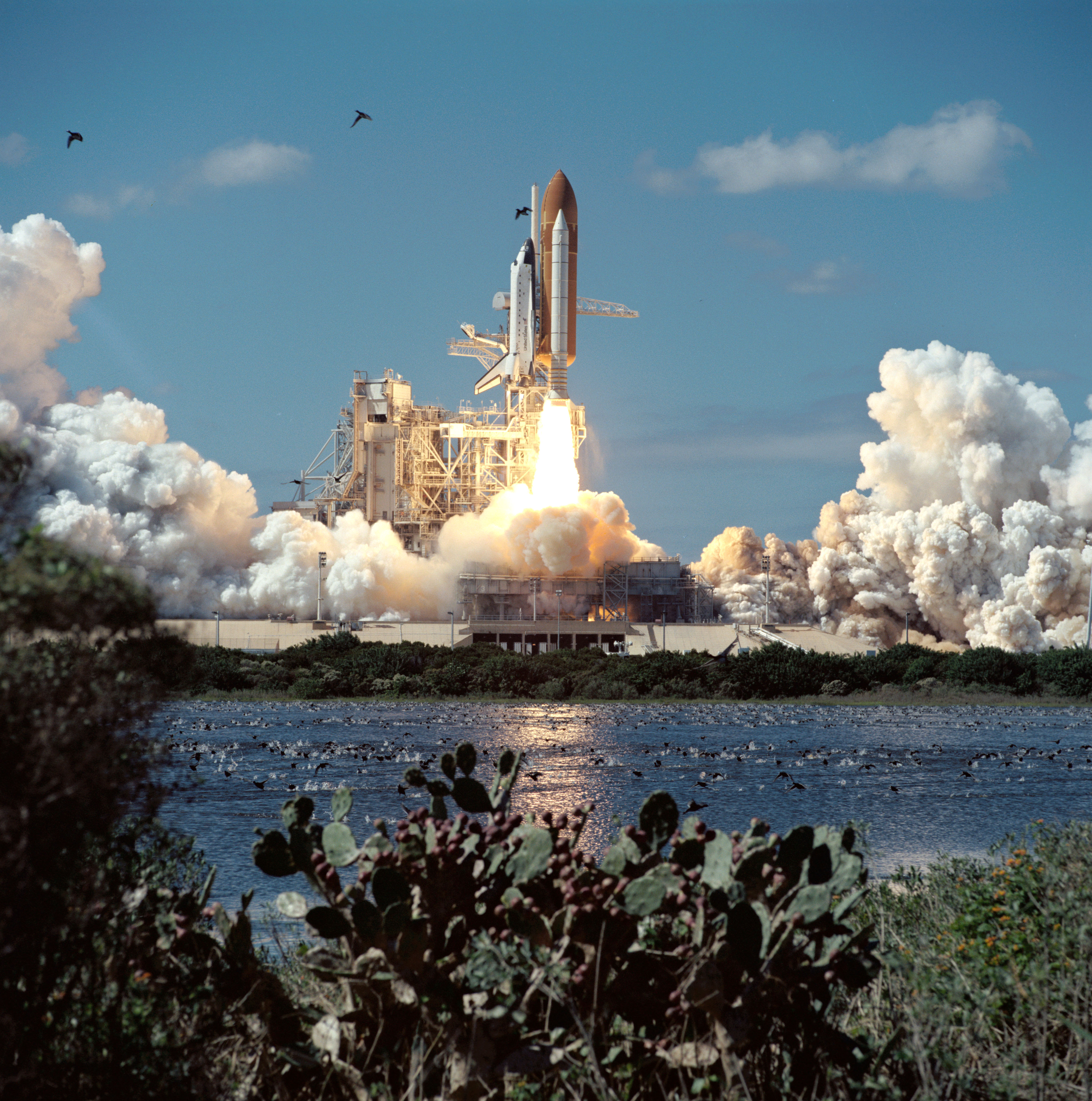
coverImage: https://www.nasa.gov/wp-content/uploads/2024/11/sts066-s-011orig.jpg
text: |
NASA explores the unknown in air and space, innovates for the benefit of humanity, and inspires the world through discovery. At its 20 centers and facilities across the country – and the only National Laboratory in space – [NASA](https://www.nasa.gov/) studies <a href="https://earth.google.com/web/" target="_blank">Earth</a>, including its climate, our Sun, and our solar system and beyond. We conduct research, testing, and development to advance aeronautics, including electric propulsion and supersonic flight. We develop and fund space technologies that will enable future exploration and benefit life on Earth.
title: |
NASA Space Program
subtitle: |
Per aspera ad astra
leftLabel: |
Hello left [label](https://www.nasa.gov)
centerLabel: |
Hello <a href="https://earth.google.com/" target="_blank">center</a> label
rightLabel: |
Hello <a href="https://earth.google.com/" target="_blank">right</a> label
imageBackground: https://static.vecteezy.com/system/resources/previews/026/459/005/non_2x/abstract-background-images-wallpaper-ai-generated-free-photo.jpg
urlImage: https://www.nasa.gov/wp-content/themes/nasa/assets/images/nasa-logo.svg
urlUpperBase: https://www.nasa.gov
---
:::
  :::ShCard
    ---
    ui:
      coverText: text-6xl bg-gradient-to-b from-[#0B3D91] via-sky-500 to-white
    coverText: |
        Welcome to </br> NASA
    opacity: true
    text: |
        NASA explores the unknown in air and space, innovates for the benefit of humanity, and inspires the world through discovery. At its 20 centers and facilities across the country – and the only National Laboratory in space – [NASA](https://www.nasa.gov/) studies <a href="https://earth.google.com/web/" target="_blank">Earth</a>, including its climate, our Sun, and our solar system and beyond. We conduct research, testing, and development to advance aeronautics, including electric propulsion and supersonic flight. We develop and fund space technologies that will enable future exploration and benefit life on Earth.
    title: |
        NASA Space Program
    subtitle: |
        Per aspera ad astra
    leftLabel: |
        Hello left [label](https://www.nasa.gov)
    centerLabel: |
        Hello <a href="https://earth.google.com/" target="_blank">center</a> label
    rightLabel: |
        Hello <a href="https://earth.google.com/" target="_blank">right</a> label
    imageBackground: https://static.vecteezy.com/system/resources/previews/026/459/005/non_2x/abstract-background-images-wallpaper-ai-generated-free-photo.jpg
    urlImage: https://www.nasa.gov/wp-content/themes/nasa/assets/images/nasa-logo.svg
    urlUpperBase: https://www.nasa.gov
    ---
  :::
  :::ShCard
  ---
  coverIcon: streamline-emojis:rocket
  text: |
    NASA explores the unknown in air and space, innovates for the benefit of humanity, and inspires the world through discovery. At its 20 centers and facilities across the country – and the only National Laboratory in space – [NASA](https://www.nasa.gov/) studies <a href="https://earth.google.com/web/" target="_blank">Earth</a>, including its climate, our Sun, and our solar system and beyond. We conduct research, testing, and development to advance aeronautics, including electric propulsion and supersonic flight. We develop and fund space technologies that will enable future exploration and benefit life on Earth.
  title: |
    NASA Space Program
  subtitle: |
    Per aspera ad astra
  leftLabel: |
    Hello left [label](https://www.nasa.gov)
  centerLabel: |
    Hello <a href="https://earth.google.com/" target="_blank">center</a> label
  rightLabel: |
    Hello <a href="https://earth.google.com/" target="_blank">right</a> label
  imageBackground: https://static.vecteezy.com/system/resources/previews/026/459/005/non_2x/abstract-background-images-wallpaper-ai-generated-free-photo.jpg
  urlImage: https://www.nasa.gov/wp-content/themes/nasa/assets/images/nasa-logo.svg
  urlUpperBase: https://www.nasa.gov
  ---
  :::
Customized ui:
NASA Space Program
Per aspera ad astra
NASA explores the unknown in air and space, innovates for the benefit of humanity, and inspires the world through discovery. At its 20 centers and facilities across the country – and the only National Laboratory in space – NASA studies Earth, including its climate, our Sun, and our solar system and beyond. We conduct research, testing, and development to advance aeronautics, including electric propulsion and supersonic flight. We develop and fund space technologies that will enable future exploration and benefit life on Earth.
This is an example with customized ui attributes for enhanced display:
::ShCard
---
ui:
    wrapper: shadow-xl bg-red-500
    title: text-4xl text-pink-800
    subtitle: font-mono text-cyan-700
    text: text-primary dark:text-black # Add text-color
    leftLabel: text-primary  # Add text-color
    centerLabel: text-primary
    rightLabel: text-primary
    upperBase: bg-red-300 # in order for this bg color to be displayed, we need to remove background prop
    lowerBase: bg-red-100
    image: hover:saturate-200 hover:scale-125 duration-300 # Options to style image
text: |
    NASA explores the unknown in air and space, innovates for the benefit of humanity, and inspires the world through discovery. At its 20 centers and facilities across the country – and the only National Laboratory in space – [NASA](https://www.nasa.gov/) studies <a href="https://earth.google.com/web/" target="_blank">Earth</a>, including its climate, our Sun, and our solar system and beyond. We conduct research, testing, and development to advance aeronautics, including electric propulsion and supersonic flight. We develop and fund space technologies that will enable future exploration and benefit life on Earth.
title: |
    NASA Space Program
subtitle: |
    Per aspera ad astra
leftLabel: | #Comment can be added on the first line
    Hello left [label](https://www.nasa.gov)
centerLabel: |
    Hello <a href="https://earth.google.com/" target="_blank">center</a> label
rightLabel: |
    Hello <a href="https://earth.google.com/" target="_blank">right</a> label
imageBackground: https://static.vecteezy.com/system/resources/previews/026/459/005/non_2x/abstract-background-images-wallpaper-ai-generated-free-photo.jpg
urlImage: https://www.nasa.gov/wp-content/themes/nasa/assets/images/nasa-logo.svg
urlUpperBase: https://www.nasa.gov
---
::
Config
These style properties can be modified via ui and are stored in the .ts file:
export default {
  wrapper: "flex flex-col max-h-fit relative group justify-between border-2 dark:border-neutral-700 hover:border-2 hover:border-primary dark:hover:border-2 dark:hover:border-primary rounded-xl mx-auto max-w-lg overflow-hidden bg-inherit shadow-2xl",
  coverImage: "absolute mb-0 bottom-0 w-full h-screen object-cover opacity-100 ease-in-out",
  coverIconWrapper: "bg-white dark:bg-neutral-800 absolute inset-0 w-full h-full object-cover z-40",
  coverIcon: "absolute inset-0 w-full h-full object-cover opacity-100 ease-in-out z-40",
  coverText: "absolute bottom-0 w-full h-full flex items-center justify-center text-center ease-in-out dark:bg-neutral-800 bg-white opacity-100",
  upperBase: "flex items-center justify-center rounded-t-xl",
  upperBaseText: "",
  image: "h-full w-screen rounded-b-xl overflow-hidden",
  lowerBase: "p-6 rounded-b-xl",
  title: "title text-3xl font-bold text-primary",
  subtitle: "subtitle text-xl font-semibold text-primary-700 dark:text-neutral-500 -mt-8",
  text: "text text-base text-gray-800 dark:text-gray-200 not-prose",
  leftLabel: "mt-3 text-lg text-gray-600 dark:text-gray-400 not-prose",
  centerLabel: "mt-3 text-lg text-gray-600 dark:text-gray-400 not-prose",
  rightLabel: "mt-3 text-lg text-gray-600 dark:text-gray-400 not-prose",
  // Default Tailwind CSS values
  default: {
  }
}
Class Descriptions
These represent the class values utilized in the constructor. These values are customizable and can be strengthened or overridden through the ui properties' attributes.
wrapper
- Value:
"flex flex-col max-h-fit relative group justify-between border-2 dark:border-neutral-700 hover:border-2 hover:border-primary dark:hover:border-2 dark:hover:border-primary rounded-xl mx-auto max-w-lg overflow-hidden bg-inherit shadow-2xl" - Description: Defines the overall container styles. The value sets a flexible column layout (
flex flex-col), limits maximum height (max-h-fit), positions relatively (relative), adds group-based styles (group), evenly spaces items (justify-between), applies a 2-unit border (border-2), enables dark mode border styling (dark:border-neutral-700), applies hover effects (hover:border-2 hover:border-primary), rounds corners (rounded-xl), centers horizontally (mx-auto), constrains width (max-w-lg), hides overflow (overflow-hidden), maintains background inheritance (bg-inherit), and adds a shadow (shadow-2xl).
coverImage
- Value:
"absolute mb-0 bottom-0 w-full h-screen object-cover opacity-100 ease-in-out" - Description: Defines styles for the cover image. The value positions the image absolutely (
absolute), removes bottom margin (mb-0), aligns it at the bottom (bottom-0), spans full width (w-full), takes up full viewport height (h-screen), maintains aspect ratio (object-cover), keeps full opacity (opacity-100), and applies smooth transitions (ease-in-out).
coverIconWrapper
- Value:
"bg-white dark:bg-neutral-800 absolute inset-0 w-full h-full object-cover z-40" - Description: Defines styles for the icon wrapper overlay. It applies a white background (
bg-white) with a dark mode variant (dark:bg-neutral-800), positions absolutely (absolute), covers the entire parent (inset-0), spans full width and height (w-full h-full), ensures it covers the object properly (object-cover), and sets a high stacking order (z-40).
coverIcon
- Value:
"absolute inset-0 w-full h-full object-cover opacity-100 ease-in-out z-40" - Description: Defines styles for the icon inside the cover. It positions absolutely (
absolute), covers the parent container (inset-0), spans full width and height (w-full h-full), ensures aspect ratio is maintained (object-cover), has full opacity (opacity-100), smooth transitions (ease-in-out), and high stacking order (z-40).
coverText
- Value:
"absolute bottom-0 w-full h-full flex items-center justify-center text-center ease-in-out dark:bg-neutral-800 bg-white opacity-100" - Description: Specifies styles for overlay text on the cover. It is positioned absolutely (
absolute), aligned to the bottom (bottom-0), spans full width and height (w-full h-full), uses flexbox for centering (flex items-center justify-center), ensures text is centered (text-center), applies smooth transitions (ease-in-out), has different background colors in light/dark mode (dark:bg-neutral-800 bg-white), and maintains full opacity (opacity-100).
upperBase
- Value:
"flex items-center justify-center rounded-t-xl" - Description: Specifies styles for the upper section. The value uses a flexible box layout (
flex), centers items (items-center justify-center), and rounds the top corners (rounded-t-xl).
upperBaseText
- Value:
"" - Description: An empty string, indicating no default styles are applied.
image
- Value:
"h-full w-screen rounded-b-xl overflow-hidden" - Description: Defines styles for the image. It takes up full height (
h-full), spans the entire screen width (w-screen), rounds the bottom corners (rounded-b-xl), and hides overflow (overflow-hidden).
lowerBase
- Value:
"p-6 rounded-b-xl" - Description: Specifies styles for the lower section. It adds padding (
p-6) and rounds the bottom corners (rounded-b-xl).
title
- Value:
"title text-3xl font-bold text-primary" - Description: Defines styles for the title text. It applies a large font size (
text-3xl), bold font weight (font-bold), and a primary color (text-primary).
subtitle
- Value:
"subtitle text-xl font-semibold text-primary-700 dark:text-neutral-500 -mt-8" - Description: Specifies styles for the subtitle text. It applies a larger font size (
text-xl), semi-bold font weight (font-semibold), a slightly different shade of the primary color (text-primary-700), a dark mode variant (dark:text-neutral-500), and a negative top margin (-mt-8).
text
- Value:
"text text-base text-gray-800 dark:text-gray-200 not-prose" - Description: Defines styles for general text. It applies a base font size (
text-base), gray text color (text-gray-800), dark mode variant (dark:text-gray-200), and ensures it is not affected by prose styling (not-prose).
leftLabel
- Value:
"mt-3 text-lg text-gray-600 dark:text-gray-400 not-prose" - Description: Defines styles for the left label text. It applies a margin-top (
mt-3), large font size (text-lg), gray text color (text-gray-600), dark mode variant (dark:text-gray-400), and ensures it is not affected by prose styling (not-prose).
centerLabel
- Value:
"mt-3 text-lg text-gray-600 dark:text-gray-400 not-prose" - Description: Specifies styles for the center label text. It applies a margin-top (
mt-3), large font size (text-lg), gray text color (text-gray-600), dark mode variant (dark:text-gray-400), and ensures it is not affected by prose styling (not-prose).
rightLabel
- Value:
"mt-3 text-lg text-gray-600 dark:text-gray-400 not-prose" - Description: Defines styles for the right label text. It applies a margin-top (
mt-3), large font size (text-lg), gray text color (text-gray-600), dark mode variant (dark:text-gray-400), and ensures it is not affected by prose styling (not-prose).
default
- Value:
{} - Description: This object is intended to hold any default Tailwind CSS values that might be used as fallback or initial styles.
These style properties ensure that the component is visually appealing and flexible, allowing for a wide range of customization to meet specific design requirements.