Carousel
Usage
Presentation
This is the display format for the constructor, designed to showcase its capabilities.
Example Basic
Carousel Example
Basic Carousel
::ShCarousel
---
title: Carousel Example
subtitle: Basic Carousel
---
  :::ShMicroCard
  ---
  layout: flat
  icon: lineicons:nasa
  urlWrapper: https://www.nasa.gov/
  title: NASA
  subtitle: Beyond the Frontier
  ---
  :::

  :::ShMicroCard
  ---
  layout: flat
  icon: gis:earth-euro-africa-o
  urlWrapper: https://science.nasa.gov/earth/facts/
  title: Earth
  subtitle: The Blue Marble
  ---
  :::

  :::ShMicroCard
  ---
  layout: flat
  icon: streamline-emojis:new-moon
  urlWrapper: https://science.nasa.gov/moon/
  title: The Moon
  subtitle: Earth's Companion
  ---
  :::

  :::ShMicroCard
  ---
  layout: flat
  icon: game-icons:mars-curiosity
  urlWrapper: https://science.nasa.gov/mars/
  title: Mars
  subtitle: Meet the neighbour
  ---
  :::
::
You can combine components inside the :
This is not recommended because different components can have different styles and it can be difficult to manage the layout and appearance of the carousel. It is better to use a single type of component for consistency and ease of use.
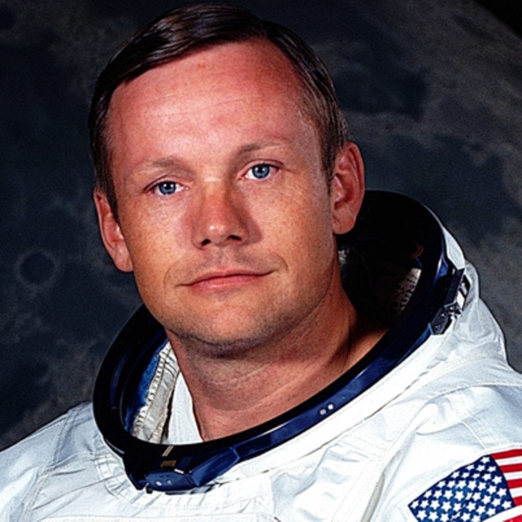
Neil A. Armstrong
Mission Commander
@NASA

Michael Collins
Command Module Pilot
@NASA
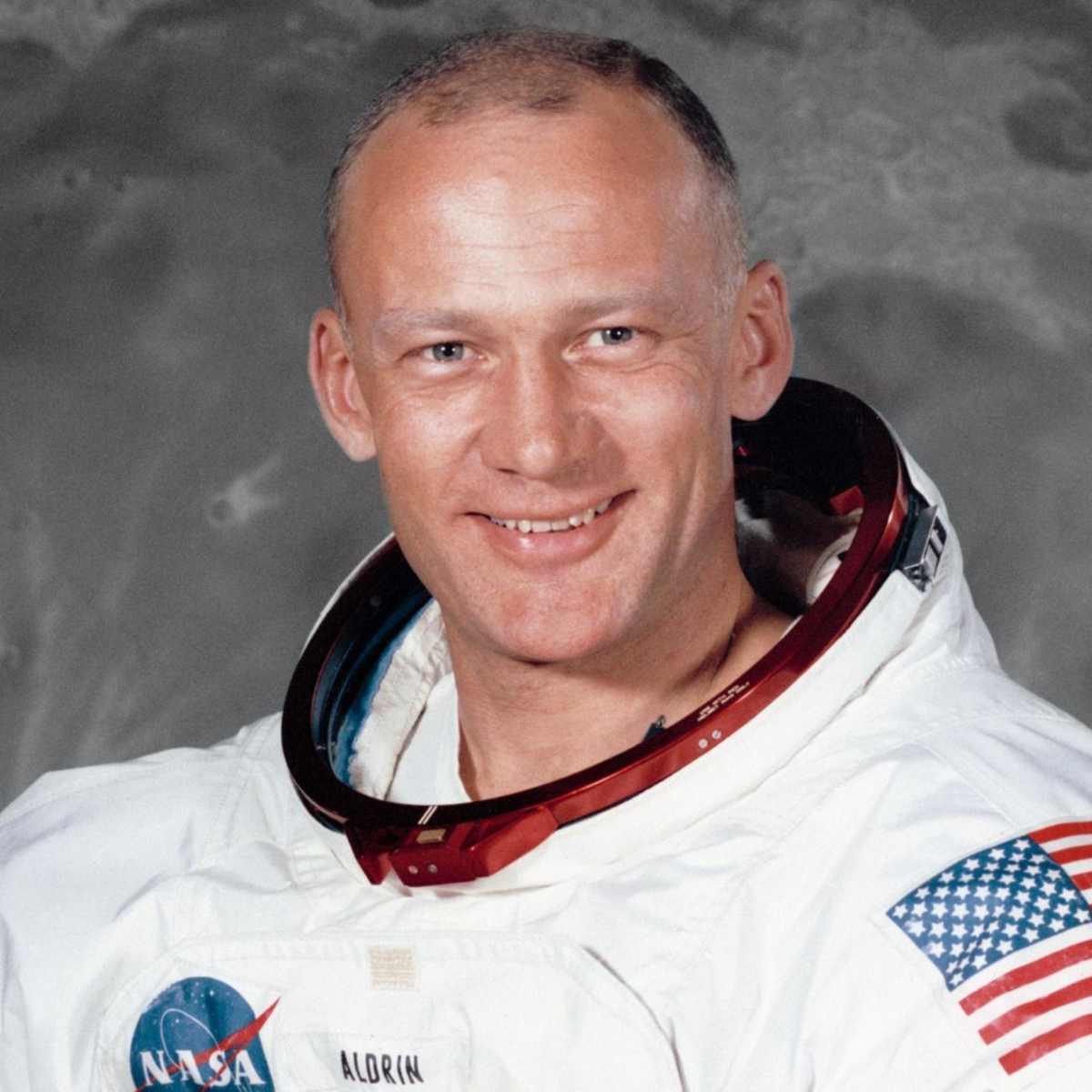
Edwin E. Aldrin Jr.
Pilot of the Lunar Lander Eagle
@NASA

::ShCarousel
---
timer: 4
---
  :::ShMicroCard
  ---
  layout: flat
  icon: game-icons:lunar-module
  urlWrapper: https://www.nasa.gov/mission/apollo-11/
  title: Apollo 11
  subtitle: First Moon Landing- Crew
  ---
  :::

  :::ShAvatar
  ---
  srcAvatar: https://endz.in/wp-content/uploads/2020/05/neil-armstrong-9188943-2-402-1024x1024.jpg
  altAvatar: Neil Armstrong
  name: Neil A. Armstrong
  role: Mission Commander
  company: NASA
  ---
  :::

  :::ShAvatar
  ---
  srcAvatar: https://www.mathrubhumi.com/image/contentid/policy:1.5627767:1644480627/image.jpg?$p=0f6e831&f=4x3&w=1080&q=0.8
  altAvatar: Michael Collins
  name: Michael Collins
  role: Command Module Pilot
  company: NASA
  ---
  :::

  :::ShAvatar
  ---
  srcAvatar: https://images.saymedia-content.com/.image/ar_1:1%2Cc_fill%2Ccs_srgb%2Cfl_progressive%2Cq_auto:eco%2Cw_1200/MjAyOTYxMzkwMjM0MTgyNzI0/buzz-aldrin-astronaut-and-innovator.jpg
  altAvatar: Buzz Aldrin
  name: Edwin E. Aldrin Jr.
  role: Pilot of the Lunar Lander Eagle
  company: NASA
  ---
  :::
::
Props
These are the properties and attributes associated with the constructor:
Properties and Attributes Description
The constructor represents a carousel component that supports rotating slides, navigation control, and automatic slide transitions. Below is a detailed description of the properties and attributes used in the constructor.
| Property | Attribute | Default | Description |
|---|---|---|---|
ui |
wrapper |
config.wrapper |
Defines the overall styling for the carousel container. |
inner |
config.inner |
Defines the styling for the inner sliding container. | |
title |
config.title |
Styles applied to the title text (e.g. font size, color). | |
subtitle |
config.subtitle |
Styles applied to the subtitle text (e.g. font size, color). | |
navigation |
config.navigation.wrapperconfig.navigation.innerconfig.navigation.activeconfig.navigation.inactive |
Styles for the navigation dots (pagination dots). | |
slides |
n/a | 1 |
Number of slides to show at once; determines how many components are displayed in one view. |
timer |
n/a | 2 |
Interval in seconds for automatic slide transitions. Set to 0 to disable auto-transition. |
title |
n/a | n/a | Optional title text displayed above the carousel. Styled via ui.title. |
subtitle |
n/a | n/a | Optional subtitle text shown below the title. Styled via ui.subtitle. |
description |
n/a | n/a | Used for documentation purposes to help content writers; does not render on the website. |
Advanced Usage
Advanced Carousel Example
Manual Control Over Slides Loop
Neil A. Armstrong
Mission Commander
@NASA
Michael Collins
Command Module Pilot
@NASA
Edwin E. Aldrin Jr.
Pilot of the Lunar Lander Eagle
@NASA
::ShCarousel
---
ui:
  wrapper: dark:bg-neutral-800
title: Advanced Carousel Example
subtitle: Manual Control Over Slides Loop
timer: 0 #Disable auto-slide
slides: 2 #Show 2 slides at once
---
  :::ShMicroCard
  ---
  layout: flat
  icon: game-icons:lunar-module
  urlWrapper: https://www.nasa.gov/mission/apollo-11/
  title: Apollo 11
  subtitle: First Moon Landing- Crew
  ---
  :::

  :::ShAvatar
  ---
  srcAvatar: https://endz.in/wp-content/uploads/2020/05/neil-armstrong-9188943-2-402-1024x1024.jpg
  altAvatar: Neil Armstrong
  name: Neil A. Armstrong
  role: Mission Commander
  company: NASA
  ---
  :::

  :::ShAvatar
  ---
  srcAvatar: https://www.mathrubhumi.com/image/contentid/policy:1.5627767:1644480627/image.jpg?$p=0f6e831&f=4x3&w=1080&q=0.8
  altAvatar: Michael Collins
  name: Michael Collins
  role: Command Module Pilot
  company: NASA
  ---
  :::

  :::ShAvatar
  ---
  srcAvatar: https://images.saymedia-content.com/.image/ar_1:1%2Cc_fill%2Ccs_srgb%2Cfl_progressive%2Cq_auto:eco%2Cw_1200/MjAyOTYxMzkwMjM0MTgyNzI0/buzz-aldrin-astronaut-and-innovator.jpg
  altAvatar: Buzz Aldrin
  name: Edwin E. Aldrin Jr.
  role: Pilot of the Lunar Lander Eagle
  company: NASA
  ---
  :::
::
Config
These style properties can be modified via ui and are stored in the .ts:
export default {
  wrapper: "relative w-full",
  title: "title text-center text-[24px] font-extrabold dark:saturate-[300%] break-words",
  subtitle: "subtitle text-center text-[20px] font-bold dark:saturate-[180%] -mt-5 break-words",
  inner: "overflow-hidden",
  navigation: {
    wrapper: "absolute left-1/2 transform -translate-x-1/2 flex gap-2 mt-2 bottom-[-1.5rem]",
    inner: "w-3 h-3 rounded-full",
    active: "bg-golden saturate-[300%]",
    inactive: "bg-gray-500",
  },
  // Default Tailwind CSS values
  default: {
  }
}
Class Descriptions
These represent the class values utilized in the exported object. These values are customizable and can be strengthened or overridden through the ui properties' attributes.
wrapper
- Value:
"relative w-full" - Description:
relative: Sets the element's position relative so children with absolute positioning can be placed inside.w-full: Makes the element take the full width of its container.
title
- Value:
"title text-center text-[24px] font-extrabold dark:saturate-[300%] break-words z-20" - Description:
title: Likely a utility class or semantic marker, does nothing unless defined elsewhere.text-center: Centers the text horizontally.text-[24px]: Custom text size of 24px.font-extrabold: Applies extra-bold font weight.dark:saturate-[300%]: In dark mode, saturates color 3x (can make colors look more intense).break-words: Breaks long words to prevent overflow.
subtitle
- Value:
"subtitle text-center text-[20px] font-bold dark:saturate-[180%] mt-1 break-words z-20" - Description:
subtitle: Liketitle, probably a semantic or utility marker.text-center: Centers the text horizontally.text-[20px]: Custom text size of 20px.font-bold: Applies bold font weight.dark:saturate-[180%]: In dark mode, increases color saturation by 180%.-mt-5: Adds a top margin in opposite direction.break-words: Prevents text overflow by breaking words.
inner
- Value:
"overflow-hidden" - Description:
overflow-hidden: Clips any overflowing child elements, useful for sliders or carousels.
navigation.wrapper
- Value:
"absolute left-1/2 transform -translate-x-1/2 flex gap-2 mt-2 bottom-[-1.5rem]" - Description:
absolute: Positions the element absolutely within the relative parent.left-1/2: Moves the element to the center horizontally.transform -translate-x-1/2: Shifts the element back by 50% of its width to perfectly center it.flex: Uses flexbox layout.gap-2: Adds space between child items.mt-2: Adds a top margin.bottom-[-1.5rem]: Custom negative bottom offset to position the navigation below content.
navigation.inner
- Value:
"w-3 h-3 rounded-full" - Description:
w-3 h-3: Width and height set to0.75rem(12px), creating a small dot.rounded-full: Makes the dot perfectly circular.
navigation.active
- Value:
"bg-golden saturate-[300%]" - Description:
bg-golden: Applies a golden background color (custom class, should be defined in Tailwind config).saturate-[300%]: Boosts color saturation, making it more vivid.
navigation.inactive
- Value:
"bg-gray-500" - Description:
bg-gray-500: Applies a medium gray background color.
default
- Value:
{} - Description:
- Empty object, reserved for fallback or shared default styles if needed later.
These style properties ensure that the is visually appealing and flexible, allowing for a wide range of customization to meet specific design requirements.