Column
Usage
The ShColumn component is used to organise content of one column in
multi-column layout. The column has header, that can render title and
subtitle in the header accompanied with an image.
Beside the main content the column also can have the footer content as well.
Basic Usage (no style)
This is how a basic ShColumn without style is displayed:
Column Title
*Column Subtitle *
This is ShColumn component design to show content of the first column.

Footer Text
This is how the above ShColumn constructor is written:
::ShColumn
---
title: Column Title #title
subtitle: "*Column Subtitle *" #use quotations
footerText: "*Footer Text*" # use quotations
---
This is `ShColumn` component design to show content of the first column.
{.w-full .rounded}
::
Basic Usage (with style)
This is how a basic ShColumn with style is displayed:
Column Title
*Column Subtitle *
This is ShColumn component design to show content of the first column.
Footer Text
This is how the above ShColumn constructor is written:
::ShColumn
---
ui:
wrapper: border-8 text-center # added border around the column and center the text
title: Column Title #title
subtitle: "*Column Subtitle *" #use quotations
footerText: "*Footer Text*" # use quotations
---
This is `ShColumn` component design to show content of the first column.
{.w-full .rounded}
::
Advanced Usage
This is an advance example of a ShColumn constructor which contains:
- Column Title and Subtitle is centered,
- Markdown text,
- Bullet points,
- An image, and
- The footer contais two inner columns.
Column Title
Column Subtitle
The ShColumn component can contain any typical Markdown content, including:
- images
- lists
- links
- ... or similar
- any supported component

The footer can have
a complex content
With great power comes
a great responsibility
This is how the above advance ShColumn is written:
Note: the body of the text is written between the end of the front-matter (
---) and the end of the ShColumn constructor (::)
::ShColumn
---
ui:
wrapper: border-8 #border to highlight the column contourn
header: #header styling
title: "tracking-wider text-primary text-center" #title styling
subtitle: "text-center" #subtitle styling
footer: "text-center" #footer styling
title: Column Title # title
subtitle: "*Column Subtitle*" #subtitle with quotations to incorporate markdown constructor
footerText: | #footer text contains two columns
:::ShTwoColumns
---
ui:
wrapper: border-8 bg-yellow-100 # show the border for the two columns with background color
---
The footer can have
a complex content
With great power comes
a great responsibility
:::
---
The `ShColumn` component can contain any typical *Markdown* content, including:
* images
* lists
* links
* ... or similar
* any supported component
[ {.w-1/2 .rounded-xl .not-prose .mb-2 .shadow-2xl} ]{.w-full .flex .justify-center}
::
Properties
These are the properties and attributes associated to the ShColumn constructor:
Properties and Attributes Description
The constructor allows you to organize content inside one column and then nest it easily in multi columns. Below is a detailed description of the properties and attributes used in the ShColumn constructor.
| Property | Attribute | Default | Description |
|---|---|---|---|
ui |
n/a | n/a | The ui property in the ShColumn constructor is a comprehensive configuration object that allows for the customization of various styling aspects of the column component. Each attribute within the ui property targets a specific part of the column display, providing detailed control over its appearance and layout. Below is a detailed description of each attribute within the ui property: |
wrapper |
config.wrapper |
Defines the overall styling for the container that holds all the elements of the column. The attribute border-8 is used to highlight the contur of the wrapper. |
|
header.wrapper |
config.header.wrapper |
This attribute is part of the header property. Defines the overall styling for the container that holds title(header.title) and subtitle(header.subtitle) |
|
header.title |
config.header.title |
This attribute is part of the header property. Styles applied to the text displaying the title of the column, such as font, size, color, etc. |
|
header.subtitle |
config.header.subtitle |
This attribute is part of the header property. Styles applied to the text displaying the subtitle of the column, such as font, size, color, etc. |
|
footer |
config.footer |
Styles applied to the text displaying the footer text of the column, such as font, size, color, etc. | |
size |
1 |
As the component ShColumn represents a single column its value is not exposed or modified; the default value is 1. Used to determine the size of a column in a grid system |
|
main |
config.main |
Styles applied to the main content (text, image, list, etc.). This attribute only can be modified by modifying the logic on `sh-column.vue` file. It cannot be modified via the markdown document. | |
title |
n/a | n/a | Title of the column |
subtitle |
n/a | n/a | Subtitle of the column |
footerText |
n/a | n/a | Text at the footer of the column |
description |
n/a | n/a | Intented to be used as a help to content writter. Doesn`t render on website. |
Config
The style attributes can be modified via ui and are stored in the ShColumn.ts and sh-grid-sizes.ts file:
ShColumn.ts
export default {
  wrapper: "",
  header: {
    wrapper: "",
    title: "text-xl not-prose",
    subtitle: "text-slate-400 py-0 not-prose"
  },
  main: "",
  footer: "text-slate-300 py-0 not-prose",
  default: {
    size: 1
  }
}
sh-grid-sizes.ts
export default {
  gridCols: [
    "grid-cols-none",
    "grid-cols-1",
    "grid-cols-2",
    "grid-cols-3",
    "grid-cols-4",
    "grid-cols-5",
    "grid-cols-6",
    "grid-cols-7",
    "grid-cols-8",
    "grid-cols-9",
    "grid-cols-10",
    "grid-cols-11",
    "grid-cols-12",
  ],
  colSpan: [
    "col-auto",
    "col-span-1",
    "col-span-2",
    "col-span-3",
    "col-span-4",
    "col-span-5",
    "col-span-6",
    "col-span-7",
    "col-span-8",
    "col-span-9",
    "col-span-10",
    "col-span-11",
    "col-span-12",
  ],
  gridRows: [
    "grid-rows-none",
    "grid-rows-1",
    "grid-rows-2",
    "grid-rows-3",
    "grid-rows-4",
    "grid-rows-5",
    "grid-rows-6",
    "grid-rows-7",
    "grid-rows-8",
    "grid-rows-9",
    "grid-rows-10",
    "grid-rows-11",
    "grid-rows-12",
  ],
  rowSpan: [
    "row-span-full",
    "row-span-1",
    "row-span-2",
    "row-span-3",
    "row-span-4",
    "row-span-5",
    "row-span-6",
    "row-span-7",
    "row-span-8",
    "row-span-9",
    "row-span-10",
    "row-span-11",
    "row-span-12",
  ]
}
Attributes Description
This section describes the attributes values utilized in the ShColumn constructor. These values are customizable and can be strengthened or overridden through the ui properties' attributes.
wrapper
- Value:
"" - Description: This defines the overall styling for the container. Currently, there are no styles applied to the
wrapper.
header
- wrapper
- Value:
"" - Description: This defines the overall styling for the header container. Currently, there are no styles applied to the
wrapper.
- Value:
- title
- Value:
"text-xl not-prose" - Description: This defines the styling for the title element. The value "text-xl not-prose" indicates that the title uses a larger text size (extra-large) and is not formatted as prose.
- Value:
- subTitle
- Value:
"text-slate-400 py-0 not-prose" - Description: This defines the styling for the subtitle element. The value "text-slate-400 py-0 not-prose" indicates that the subtitle uses a slate gray color with zero padding on the top and bottom, and is not formatted as prose.
- Value:
main
- Value:
"" - Description: This defines the overall styling for the main content area. Currently, there are no styles applied to the
main.
footer
- Value:
"text-slate-300 py-0 not-prose" - Description: This defines the styling for the footer element. The value "text-slate-300 py-0 not-prose" indicates that the footer uses a lighter slate gray color with zero padding on the top and bottom, and is not formatted as prose.
default
- Value:
{ size: 1 } - Description: This object is intended to hold any default Tailwind CSS values that might be used as fallback or initial styles. In this case, it sets a default size value of 1.
These style properties ensure that the ShColumn component is visually appealing and flexible, allowing for a wide range of customization to meet specific design requirements.
FAQs
Q: Is header an attribute and can we configure its style?
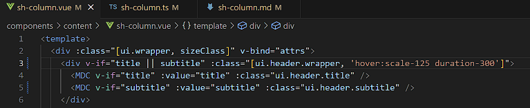
Header is an object that contains wrapper, title, and subtitle. It is there so we can differentiate e.g. wrapper for the whole constructor and wrapper only for the header section. So basically, we cannot style header with classes but only objects inside of it. What could we do if we wanted to add class to header is either target the header.wrapper or we can concatenate classes like in the picture below on the line 3
Q: Is size a property or an attribute? Can we style it?
Size is a property with values of a whole number. This number represents an element in an array from sh-grid-sizes.ts. In this case, it takes the value of an element from colSpan array. So if we wanted to style it, we would have to change something in sh-grid-sizes.ts, but since the value of size is a number and it is used specially for grid, adding some other style in array would not make much sense.
Q: Is main an attribute or property? Can we style it? (it is defined in the sh-column.ts property)
Main is an attribute with values of classes. It can be styled and it is to be found in sh-column.ts but it is currently without any values. We could add background to the main and only that section of constructor will have that background.
