Introduction
All of the components, and how to use them are shown in Components section. Since look&feel plays crucial role in UX, here you will find guidelines to all the different styling options.
OMA Color Shades
OMA consists of five primary colors (red, purple, cyan, yellow & blue). Each of this colors have their value presented in hexadecimal. In order to use the potential of these colors, we have provided diffferent shades of them through https://maketintsandshades.com/.
Process behind creating this palet was simple; take the hexadecimal value, insert it on site shown above and choose the values. Since the site gives you shades in percentage from your original hexadecimal value to lightest, as well as from original to darkest, we had to choose what percentages we want.
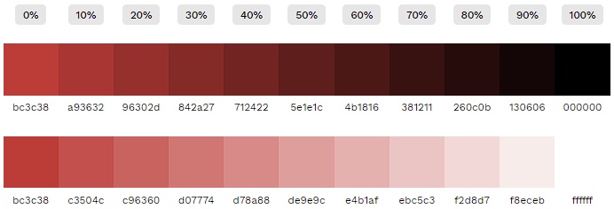
OMA Red (#bc3c38) used for example above
And here is the table that sorted out what percentages are used (every color takes the same percentage)
| N° | Tailwind Value | Percentage % |
|---|---|---|
| 1. | 50 | 80% |
| 2. | 100 | 60% |
| 3. | 200 | 40% |
| 4. | 300 | 20% |
| 5. | 400 | 10% |
| 6. | 500 | 0% |
| 7. | 600 | 10% |
| 8. | 700 | 20% |
| 9. | 800 | 30% |
| 10. | 900 | 40% |
| 11. | 950 | 50% |
Here is the code representation found in tailwind.config.ts file:
import type { Config } from 'tailwindcss'
import defaultTheme from 'tailwindcss/defaultTheme'

export default <Partial<Config>>{
  content: [
    'ui.config/*.ts'
  ],
  theme: {
    extend: {
      colors: {
        oma: {
          red: {
            50: '#f2d8d7',
            100: '#e4b1af',
            200: '#d78a88',
            300: '#c96360',
            400: '#c3504c',
            500: '#bc3c38',
            600: '#a93632',
            700: '#96302d',
            800: '#842a27',
            900: '#712422',
            950: '#5e1e1c'
          },
          purple: {
            50: '#e6dcec',
            100: '#cdbad9',
            200: '#b497c6',
            300: '#9b75b3',
            400: '#8f63aa',
            500: '#8252a0',
            600: '#754a90',
            700: '#684280',
            800: '#5b3970',
            900: '#4e3160',
            950: '#412950'
          },
          yellow: {
            50: '#f8eedc',
            100: '#f1ddba',
            200: '#ebcb97',
            300: '#e4ba75',
            400: '#e0b263',
            500: '#dda952',
            600: '#c7984a',
            700: '#b18742',
            800: '#9b7639',
            900: '#856531',
            950: '#6f5529'
          },
          cyan: {
            50: '#e9f6f3',
            100: '#d2ede7',
            200: '#bce4dc',
            300: '#a5dbd0',
            400: '#9ad7ca',
            500: '#8fd2c4',
            600: '#81bdb0',
            700: '#72a89d',
            800: '#649389',
            900: '#567e76',
            950: '#486962'
          },
          blue: {
            50: '#cddcec',
            100: '#9ab8da',
            200: '#6895c7',
            300: '#3571b5',
            400: '#1c60ab',
            500: '#034ea2',
            600: '#034692',
            700: '#023e82',
            800: '#023771',
            900: '#022f61',
            950: '#022751'
          }
        }
      }
    }
  },
  safelist: [
    {
      pattern: /gap-.*/
    }
  ]
}
Thus, every shade of OMA official color is now available using Tailwind classes presented in table below.
Feel free to checkout the table below and select the color that suits the best!

Colors with values of 500 are official colors of OMA, so if you ever need their hexadecimal values, just look at this chart and compare it against the
tailwind.config.tsfile where all hexadecimal values live